ParalympicsGB has officially launched a new brand identity, transitioning to a more accessible and flexible visual system as the organization prepares for the Los Angeles 2028 Paralympic Games. The update, developed in collaboration with the experiential agency LIVE·TEAM, aims to foster year-round engagement with the British public while moving away from traditional, Games-time-only branding.
This strategic shift reflects a broader effort to maintain visibility throughout the entire Paralympic cycle, rather than focusing solely on the high-profile windows of the Summer and Winter Games. By introducing a refined, legible typeface and a broader, more vibrant color palette, the organization intends to create a consistent presence across its digital platforms, social media channels, and physical athlete environments, including prep camps and the athletes’ village.
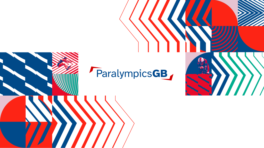
A Design for Accessibility and Longevity
The core of the rebranding project centers on accessibility and the ability to connect with a wider, younger audience. Led by Senior Designer Alex Antoniou, the team at LIVE·TEAM worked to evolve the existing ParalympicsGB logo, adjusting the typeface to improve legibility and developing a dynamic visual language that remains effective across diverse digital and physical touchpoints.
According to Sarah Keeble, ParalympicsGB Brand and Marketing Manager, the initiative was designed to evolve the organization’s existing brand equity into a more cohesive system. Keeble noted that the team sought to refresh the look and feel to deepen connections with key audiences, aiming to challenge perceptions of disability and celebrate the organization’s history as the home of Paralympic sport. The new identity is intended to provide a stable foundation for future campaigns, ensuring that the ParalympicsGB brand is as recognizable in the years between major international competitions as it is during the Games themselves.
Strategic Shift in Fan Engagement
The move toward a more consistent, year-round brand identity aligns with evolving strategies among UK sporting organizations, which are increasingly prioritizing digital communication and continuous fan engagement. By moving beyond the traditional red, white, and blue palette, the new design allows for greater flexibility and visual impact, enabling the brand to adapt to various contexts, from grassroots outreach to elite performance environments.
This update is part of a wider commitment by British Olympic and Paralympic bodies to align with public expectations and modern accessibility standards. By establishing a unified visual structure, ParalympicsGB is positioning itself to better communicate its mission, break down barriers, and maintain a consistent narrative leading into Los Angeles 2028 and beyond.
Looking Toward Los Angeles 2028
As preparations for the Los Angeles 2028 Paralympic Games continue, this new visual system will be implemented across all official ParalympicsGB communications, including campaigns and live events. The organization’s focus remains on building a sustainable, long-term connection with fans, ensuring that the athletes’ stories are told with clarity and impact, regardless of the competition calendar.
Readers interested in following the progress of the team as they prepare for upcoming international cycles can find the latest updates and official announcements on the ParalympicsGB official website. We invite our readers to share their thoughts on the new visual direction in the comments section below.
Keep reading