
Google has initiated a visual update for the Google Chat application, specifically modifying its status bar icon to address ongoing user confusion with the Google Messages notification symbol. Following the widespread rollout of the company’s unified Workspace branding, the change aims to provide clearer visual distinction between the two primary communication platforms within the Android ecosystem.
The adjustment, first identified in recent beta versions of the Google Chat Android application, replaces the previous design—which bore a striking resemblance to the blue chat bubble used by Google Messages—with an icon that more closely aligns with the official Google Chat logo. According to reports from 9to5Google, this design shift is intended to help users quickly identify the source of incoming notifications in their status bar without needing to expand the notification shade.
Addressing User Interface Confusion
For years, users have reported difficulty distinguishing between Google’s various messaging services due to overlapping design languages. The previous Google Chat status bar icon featured a solid-colored, bubble-like shape that closely mirrored the aesthetic of the Google Messages app, leading to instances where users frequently conflated the two services. By shifting the icon to a more distinct, stylized representation of the Chat logo, Google is attempting to streamline the Android user experience.
This design update comes as part of a broader, multi-year effort to standardize the appearance of Google Workspace applications. As noted in the official Google Workspace blog, the company has transitioned most of its productivity suite to a consistent four-color palette—blue, red, yellow, and green—designed to signal that these tools are part of a singular, integrated ecosystem. While this consistency helps with brand recognition, it often forces developers to rely on subtle shape differences to differentiate specific product features.
Technical Implementation and Rollout
The change is currently being pushed via server-side updates to the Google Chat Android application. This means that users do not necessarily need to download a manual update from the Google Play Store to see the change, as the server-side architecture allows Google to toggle UI elements remotely. According to documentation on the Google Workspace developer portal, these incremental UI tweaks are a standard part of the company’s agile development cycle, designed to improve accessibility and app recognition.
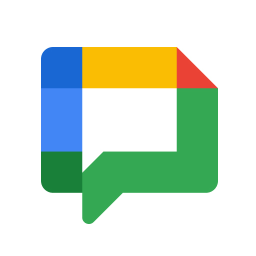
The modification specifically targets the status bar, which is the narrow strip at the top of the Android display where notification icons reside. By prioritizing icon legibility, Google is adhering to the Material Design 3 guidelines, which emphasize clarity and user-centric navigation. For developers and power users monitoring the Android environment, this change represents a shift toward more distinct iconography in an increasingly crowded notification area.
Evolution of the Google Communication Suite
The confusion between Google Chat and Google Messages is rooted in the platform’s history. While Google Messages is primarily used for SMS, MMS, and Rich Communication Services (RCS), Google Chat serves as the enterprise-focused alternative, integrated directly into Gmail and the broader Workspace suite. Over the past several years, Google has attempted to consolidate these services, most notably by retiring Google Hangouts and pushing users toward these two distinct, yet visually similar, products.
Industry analysts have long pointed out that the visual convergence of Google’s messaging tools can create friction for enterprise users who utilize both platforms simultaneously. By refining the icon, Google is acknowledging the necessity of visual cues in maintaining efficient workflows. This update does not change the underlying functionality of the application, but it serves as a critical usability improvement for the millions of users who rely on the platform for daily communication.
What Happens Next
Google has not provided an official timeline for when this icon change will be fully available to all users across all regions, though such updates typically reach the entire user base within a few weeks of the initial rollout. Users who wish to see the change immediately may check for app updates in the Google Play Store, though the server-side nature of the update means it may appear automatically without user intervention.
As Google continues to refine its Workspace suite, further UI adjustments to ensure product differentiation are expected. Readers interested in tracking these changes can monitor the official Google Workspace Updates blog for future announcements regarding interface and functionality improvements. Please share your thoughts on whether this new icon makes your daily workflow easier in the comments section below.
Keep reading