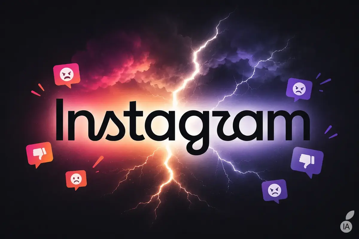
Instagram Alters Iconic Script for First Time in a Decade
Instagram has rolled out a fresh wordmark update, modifying the custom typography displayed at the top of the mobile application for the first time in a decade. The visual update, introduced by Instagram head Adam Mosseri, shifts the platform away from its long-running script lettering toward a heavier, highly rounded, and minimalist black typeface. While the company intended to deliver a cleaner, more contemporary aesthetic aligned with modern digital design standards, the rollout immediately triggered widespread user debate across social media channels regarding its legibility and overall necessity.
The visual modification applies exclusively to the typographic representation of the platform’s name rather than the iconic multi-colored camera app icon located on smartphone home screens. Over the past ten years, the Meta-owned platform has expanded far beyond its original photo-sharing roots into a sprawling ecosystem featuring Stories, Reels, direct messaging, algorithmic feeds, and artificial intelligence. According to platform leadership, updating the primary wordmark was designed to modernize the interface while retaining subtle structural references to the brand’s established visual identity.
Minimalist Design Trends Meet Public Scrutiny
Users quickly took to the comment sections of the leadership announcement to dissect the changes. The newly redesigned lettering features thick, solid strokes with minimal spacing between characters, completely dropping the previous gradients, outlines, and delicate script curves. This stripped-back approach mirrors contemporary branding trends seen across numerous digital media platforms.
Kerning Flaw Sparks Viral Reading Phenomenon
Despite the push toward a cleaner digital aesthetic, the new typography met swift scrutiny from online communities. A primary point of critique centers on character kerning and letterform proximity, particularly involving the lowercase letter “r”. Shortly after the debut, numerous users pointed out that the compressed spacing causes the word to visually register as “Instagzam” rather than “Instagram,” an interpretation that quickly went viral across the platform’s comment threads.
A Fractured User Base and Legacy Resistance
Reactions among the user base remain sharply divided. While some users welcomed the simplified presentation, more conservative users questioned why major technology corporations routinely alter perfectly recognizable visual identities. Observers note that visual changes on platforms utilized daily by hundreds of millions of people almost invariably trigger initial friction and pushback from established communities accustomed to legacy designs.
Home Screen Continuity and Meta’s Next Moves
The typography update represents a graphic evolution rather than a complete platform overhaul. The familiar camera icon remains completely unchanged on iOS and Android devices, ensuring that the service retains immediate visual recognition on user home screens. The revision strictly targets the internal wordmark headers.
As the platform continues to balance regular product updates with interface refreshes, community feedback highlights the delicate nature of altering iconic digital touchpoints.
- Dreo TurboCool Misting Fan 765S Review: Ultimate Cooling for Hot Summers
- Huawei Band 11 Review: Long Battery Life, Health Tracking, and Value Analysis
- Eccentrica Unveils V12 Roadster: A Re-Engineered Lamborghini Diablo Open-Top (time.news)
- Chinese Giant Acquires MediaMarkt in Historic Move After Decade (newsdirectory3.com)