Lightning & Bruins Unveil Striking Stadium Series Jerseys for 2026
The Tampa Bay Lightning and Boston Bruins have revealed their jerseys for the 2026 NHL Stadium Series, and they’re making a splash. These aren’t just new uniforms; they’re carefully crafted designs steeped in team history and tailored for the spectacle of outdoor hockey. Let’s dive into the details of what makes these jerseys stand out.
Tampa Bay Lightning: A Bolt of innovation
The Lightning’s new look introduces a fresh, sky-blue hue to their color scheme. This shade honors the team’s conventional colors while acknowledging the Florida sunshine where the game will be played. But the real innovation lies in how they’ve depicted lightning itself.
For the first time, the Lightning jersey features photo-realistic lightning integrated directly into the letters and numbers. This isn’t a simple cartoon bolt. Previous attempts, like the 1990s alternate jerseys and the 2022 “Reverse Retro” designs, used more stylized lightning.
According to Brian Fillion, the Lightning’s VP of Brand Experience, achieving this effect was a meticulous process. His team collaborated with digital artists and the jersey manufacturer to perfect the materials and colors.
Here’s what went into the design:
* Detailed Veins: Artists painstakingly crafted each “vein” of lightning, ensuring the correct width, placement, and density.
* Color Optimization: The sky-blue base and the lightning bolt coloring were tweaked to maximize visual impact.
* Obsessive Detail: Fillion emphasizes the team’s commitment to detail, believing it’s what sets their designs apart.
Beyond the lightning, the jersey incorporates pirate imagery, a nod to Tampa Bay’s rich maritime history. Fanatics provided imagery of the jersey, showcasing these intricate details.
Boston Bruins: A Golden revival with a new England Touch
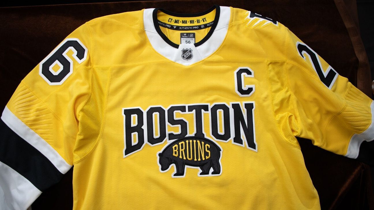
The Bruins’ Stadium Series jersey centers around a bolder, more vibrant shade of gold. This striking color choice instantly grabs attention. Like the Lightning, the Bruins also received a new logo designed specifically for the event.
This logo features a prominent “B” with five claw marks surrounding it. You’ll find this claw mark motif repeated on the team’s pants and helmets as well.
The jersey’s crest pays homage to the Bruins’ past:
* Bear Shoulder Patch: The jersey features the bear shoulder patch introduced this season.
* City & Nickname: The word “Boston” appears prominently, echoing jerseys from the 1920s that included both the city name and team nickname.
Adding a subtle Florida connection, the sleeves boast an embossed sunburst pattern. A hidden “easter egg” – a sunburst design – is also found on the tag inside the jersey.
a potentially controversial detail: the jersey collar includes the acronyms of all six New England states, including Connecticut. This might not sit well with fans nostalgic for the Hartford Whalers.
These jerseys represent more than just new apparel. They’re a celebration of team identity, a nod to history, and a visual spectacle designed for the unique atmosphere of an outdoor hockey game. You can view images of both jerseys in the ESPN tweet embedded below.
THE 2026 NHL STADIUM SERIES JERSEYS HAVE ARRIVED 🏟️
which one do you like better? 🤔 pic.twitter.com/rzhH90LnRE
– ESPN (@espn) December 12, 2025
Ultimately, both the Lightning and Bruins have delivered jerseys that are sure to excite fans and become collector’s items.they demonstrate a commitment to design, history, and the unique experience of outdoor hockey.
Related reading
- Leila Elwi Stun in Rome: Casual Chic Looks and Maratea Film Festival Honor
- Scott McTominay Set for New Napoli Contract Extension Under Allegri
- Banana Ball Arrives in Boise Live Coverage from Albertsons Stadium (news-usa.today)
- Samsung Galaxy S27 Ultra Leaks Reveal Big Battery and Design Upgrades (archyde.com)