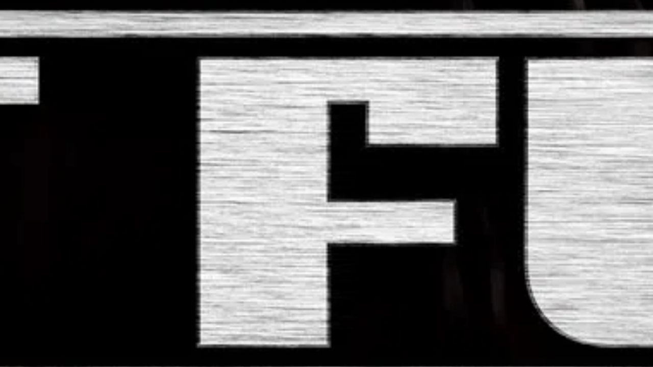
The art of movie marketing often hinges on a single, striking element: the film poster. For cinephiles, recognizing a masterpiece from a partial glimpse of its typography is more than just a hobby; it is a test of cultural literacy and a deep appreciation for the visual language of cinema. As we continue our exploration of iconic graphic design in film, we turn our attention to the challenging and often stylized world of movie poster typography.
In our latest installment of our series on movie title design, we are putting your observational skills to the test with an interactive movie poster quiz focusing on the letter “F.” This challenge invites readers to identify eight distinct films based solely on the unique font, kerning, and artistic flair of their title treatments. Whether you are a fan of classic noir, modern blockbusters, or avant-garde independent cinema, this quiz is designed to challenge even the most dedicated film buffs.
The Intersection of Graphic Design and Cinematic Identity
Typography in film posters acts as the silent ambassador of a movie’s narrative. From the hand-painted brushstrokes of mid-century classics to the sleek, minimalist sans-serif fonts dominating contemporary streaming services, the choice of typeface is never accidental. According to industry standards for visual communication in entertainment, the font serves as the first point of emotional contact between the audience and the story, often signaling genre cues—such as horror, romance, or high-stakes action—before a single frame of footage is viewed (AIGA Design Archives).
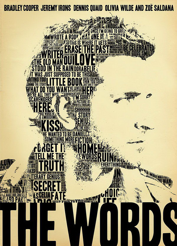
When analyzing these posters, consider the “personality” of the letter “F.” Is it sharp and angular, suggesting tension or futuristic themes? Or is it rounded and serif-heavy, perhaps evoking a sense of heritage, period drama, or whimsical storytelling? Mastering the ability to identify these subtle shifts in design is a hallmark of a true student of film history.
Why Typography Matters in Modern Marketing
In an era where audiences are inundated with content choices on platforms like Netflix or Disney+, the “thumb-stop” power of an image is critical. Studios invest significant capital into the development of custom title cards that can be recognized instantly on a mobile screen or a theater marquee. This level of branding ensures that the visual identity of a franchise—such as the iconic, weathered lettering seen in historical epics—remains etched in the public consciousness long after the film has left the box office.
How to Participate in Our Latest Challenge
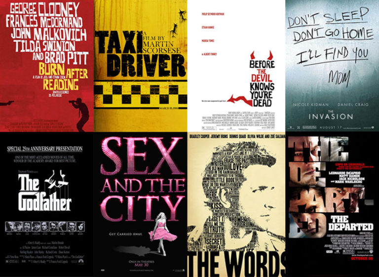
To participate in this week’s challenge, simply examine the eight provided posters. We have stripped away the main imagery to ensure that you are focusing entirely on the typographical elements. We encourage you to look for clues in the color palette, the texture of the letters, and the specific spacing that has become synonymous with the film’s marketing campaign.
This series is part of our ongoing commitment to celebrating the craft behind the camera. By examining the visual history of cinema, we gain a better understanding of how directors and marketing teams collaborate to shape our expectations. For those looking to expand their knowledge of film history or catch up on the latest industry trends, we recommend exploring resources like the Academy of Motion Picture Arts and Sciences’ Margaret Herrick Library, which serves as a definitive archive for cinematic art, and design.
Key Takeaways for Cinephiles
- Visual Literacy: Understanding typography helps viewers appreciate the hidden layers of film marketing.
- Genre Clues: Typefaces are strategically chosen to align with the emotional tone of the film.
- Iconic Branding: Successful films often use proprietary fonts that become part of their global brand identity.
- Interactive Engagement: Quizzes are an excellent way to test your memory and share your passion with the wider film community.
Looking Ahead: The Future of Film Presentation
As we move further into 2026, the landscape of how we consume and identify films continues to evolve. With the rise of high-definition digital displays and the integration of interactive elements in streaming interfaces, the way we interact with movie posters is shifting from static observation to dynamic engagement. We look forward to seeing how the next generation of graphic designers pushes the boundaries of title treatments in upcoming releases.
We invite our readers to share their results and discuss their favorite title designs in the comments section below. Do you have a favorite font from a film poster that you think is underappreciated? Let us know your thoughts. Stay tuned for our next installment, where we will move to the next letter in our series and continue to test your knowledge of the cinematic arts. Our next update on film history and design series is currently scheduled for early next month; be sure to subscribe to our newsletter for the latest notifications.
Keep reading