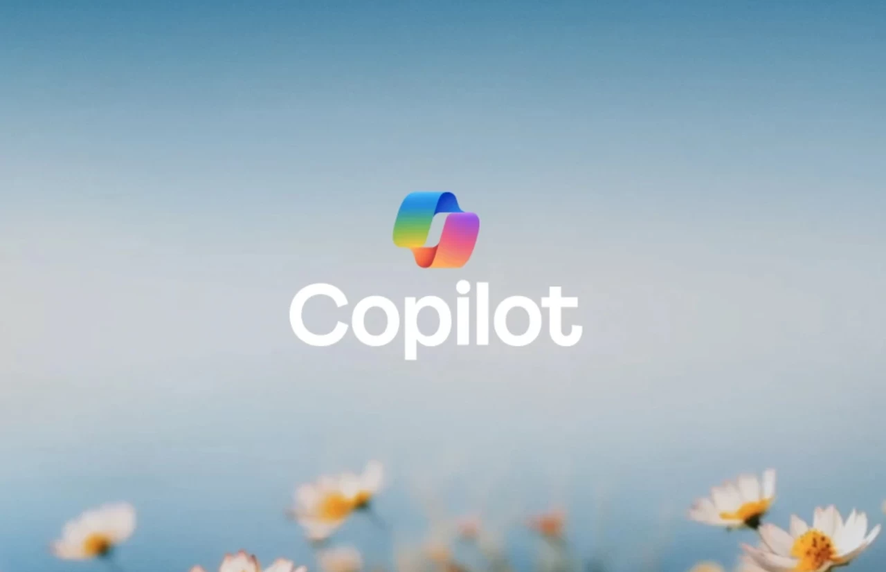
Microsoft may have accidentally leaked a redesign for its Copilot artificial intelligence assistant, offering an early glimpse at a more minimalistic icon across its digital platforms. The updated branding surfaced briefly through official software channels and support pages, sparking widespread speculation among software developers and tech analysts regarding an impending visual refresh for the productivity tool.
The revised aesthetic trades the intricate, multi-toned swirl of the current logo for a simpler, streamlined shape. According to reports from technology publication The Verge, the adjustment aligns with broader design system updates across Windows and Microsoft 365, which increasingly favor flat graphics and reduced visual clutter. While the Redmond-based technology giant has not yet issued a formal public statement or press release confirming a permanent rollout, the modified assets appeared in recent pre-release software builds.
For everyday users and enterprise organizations relying on artificial intelligence integration, visual updates signal how deeply embedded these tools are becoming within operating system interfaces. As companies refine their branding to stand out in a crowded generative AI market, minor shifts in iconography often foreshadow major software updates or feature expansions.
Understanding the Minimalistic Shift in Software Design
User interface changes in major software ecosystems rarely happen by chance. When a global software provider like Microsoft alters a flagship product’s logo, it usually reflects a deliberate effort to improve legibility across varied screen sizes—from high-resolution desktop monitors down to mobile phone displays and taskbar tray icons.
The current Copilot branding, introduced following the company’s transition away from earlier Bing-branded chat tools, utilizes vibrant color gradients meant to evoke creativity and modern computing. However, modern enterprise software design standards increasingly prioritize monochrome compatibility, dark mode adaptability, and instant visual recognition. A cleaner, more minimalistic icon ensures that the assistant remains easily identifiable whether pinned to a Windows taskbar, integrated into Microsoft Word, or accessed via mobile applications.
Industry observers note that similar rebranding efforts have occurred across rival platforms as generative AI tools mature from experimental novelties into core daily utilities. By softening gradients and simplifying geometry, software designers reduce visual fatigue for users who interact with these applications continuously throughout the workday.
Implications for Users and Enterprise Environments
While an icon change is primarily cosmetic, it carries practical implications for user experience and enterprise deployment. IT administrators managing corporate device fleets often prepare employees for interface adjustments to minimize helpdesk inquiries when familiar buttons or logos shift.
Furthermore, consistent branding helps distinguish native operating system integrations from third-party wrappers or web extensions. As Microsoft continues to embed artificial intelligence deeper into Windows 11 and its productivity suite, establishing a clear, recognizable visual anchor is essential for user trust and navigation.
Organizations and individual consumers monitoring these updates can look to official Microsoft support documentation and developer blogs for future announcements regarding interface rollouts. Official channels remain the definitive source for confirmation on when—or if—the updated branding will deploy to general release channels.
Next Steps and Official Announcements
Microsoft has not announced an official release date for the suspected icon update, and preview builds frequently test design concepts that may change prior to public distribution. Users interested in tracking official software changes can review update logs released through the Windows Insider Blog for verified details on upcoming interface modifications.
Have you spotted the new Copilot icon in your software builds, or do you prefer the current design? Share your thoughts and join the discussion in the comments below.
Related reading