
Liquid Glass Design Award: Apple Triumphs Amid Readability Concerns
Apple has secured a major victory in the world of digital aesthetics, earning a prestigious Gold Cube honor for its controversial Liquid Glass redesign. The recognition comes as part of a strong showing for the company at the 2026 Art Directors Club of New York awards, where Apple took home a total of six wins.
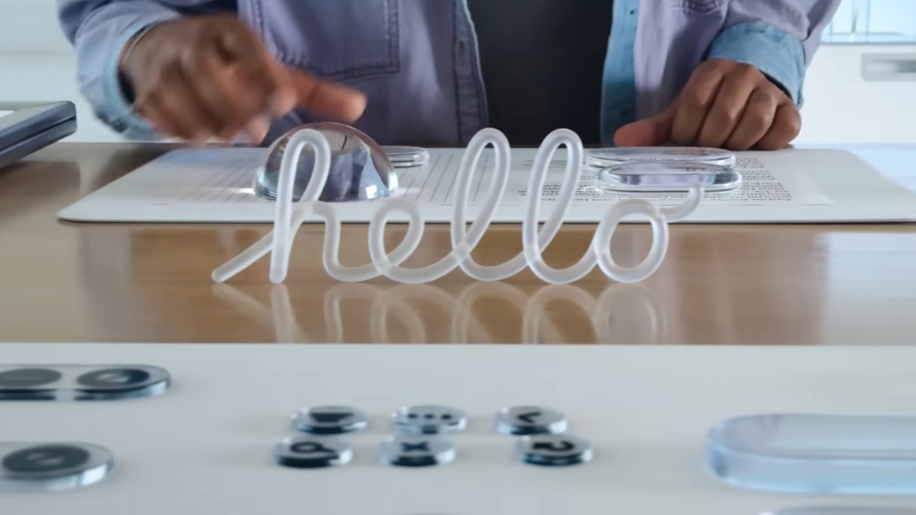
For those of us who track the intersection of software engineering and visual design, this win is particularly striking. The Liquid Glass interface represents a bold shift in Apple’s visual identity, yet it has remained a flashpoint for debate among power users and accessibility advocates since its debut. The tension between high-art recognition and daily utility is a recurring theme in consumer electronics, and this award brings that conflict into sharp focus.
While the award validates the vision of Apple’s in-house design team, the company is already preparing to address the practical shortcomings of the interface. Reports indicate that Apple is expected to showcase an improved version of the design at WWDC 2026, suggesting that the company is listening to the vocal opposition regarding the user experience.
A Golden Victory in New York
The Art Directors Club of New York is renowned for honoring excellence in craft and design. Winning a Gold Cube is widely considered one of the highest achievements in the industry, signaling that a project has met an elite standard of innovation and execution. For Apple, the Liquid Glass redesign was the crown jewel of their six total wins this year.

The selection process was handled by a design jury consisting of 13 judges. While the jury has not yet released official comments regarding their specific reasoning for the choice, the pitch submitted by Apple’s in-house design team provides a window into the project’s goals. The pitch detailed the aesthetic ambitions of the redesign, aiming to push the boundaries of how users interact with digital surfaces across the Apple ecosystem.
This victory reinforces Apple’s position as a trendsetter in digital aesthetics, even when those trends initially polarize the user base. The Gold Cube serves as a professional endorsement of the “Liquid Glass” philosophy, prioritizing a specific, modern visual language that the jury found exceptional.
The Friction Between Aesthetics and Utility
Despite the accolades from the design community, the transition to Liquid Glass has not been seamless for all users. The redesign has faced significant opposition primarily centered on user interface readability. These concerns are not limited to a single device but have been reported across the Mac, iPhone, and iPad.

In my experience reviewing software, the “readability gap” is a critical failure point. When a design is praised by a jury but criticized by the end-user for legibility, it suggests a disconnect between artistic intent and ergonomic reality. For many, the sheer beauty of the Liquid Glass effect—characterized by its fluid, translucent qualities—has come at the cost of clear contrast and effortless navigation.
The controversy highlights a fundamental challenge in cross-platform design: ensuring that a visual language remains functional across varying screen sizes and lighting conditions. What looks stunning in a curated design portfolio can become a hindrance when a user is trying to read a notification in bright sunlight or manage a complex spreadsheet on a Mac.
The Road to WWDC 2026
Apple is unlikely to let the Gold Cube award blind them to the practical frustrations of their global audience. The expectation that an improved version of Liquid Glass will be revealed at WWDC 2026 suggests a strategic pivot toward “refined” aesthetics—maintaining the award-winning look while solving the readability issues that have plagued the initial release.
This cycle of “bold launch, then refine” is a familiar pattern for the company. By pushing a provocative design first, Apple establishes a new visual baseline, then uses developer and consumer feedback to polish the experience into something sustainable for the long term. The upcoming updates will likely focus on enhancing contrast ratios and adjusting transparency layers to ensure that accessibility is not sacrificed for style.

For users currently struggling with the interface, the upcoming developer conference will be the key checkpoint to see if Apple can successfully bridge the gap between the jury’s praise and the user’s needs.
The official ceremony for the Art Directors Club of New York awards is scheduled for May 15, 2026. It is expected that the 13 judges may provide further insight into their decision at that time, offering a clearer explanation of why the Liquid Glass redesign earned the top honor despite its ongoing controversy.
Do you prefer the bold look of Liquid Glass, or do you find it hinders your productivity? Share your thoughts in the comments below.