google TV Gets a Fresh Look with Material 3 expressive Redesign
Google TV is receiving a notable visual overhaul with the rollout of the Material 3 Expressive design.This update brings a more modern and vibrant aesthetic to your entertainment hub,aligning it with recent redesigns across several Google apps.
HereS a look at the previous Google TV design:
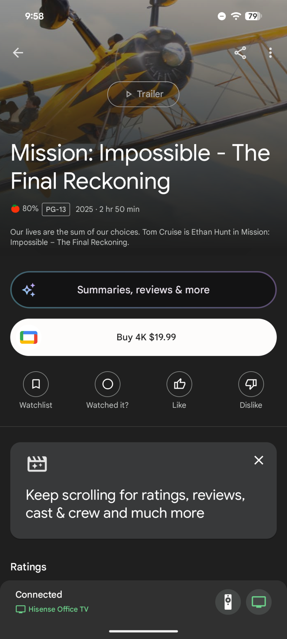
What’s Changing?
This isn’t a one-off change. Google has been actively updating its suite of apps with the Material 3 Expressive redesign.You’ve likely already noticed it in apps like Google Clock, Pixel Recorder, Calculator, and Keep. This consistent design language creates a more unified and intuitive experience across your devices.
Diving Deeper into Material 3 Expressive
Material 3 Expressive focuses on a few key elements:
Enhanced Visuals: Expect bolder colors,more rounded shapes,and a generally more dynamic interface.
Improved Usability: The redesign aims to make navigating Google TV even easier,with a focus on clarity and accessibility.
* consistent Experience: As more Google apps adopt this design, you’ll find a familiar and comfortable look and feel throughout the ecosystem.
I’ve found that these types of consistent design updates really streamline the user experience. it’s nice when apps feel like they belong to the same family.This update is part of a broader trend within Google to refresh its software with a more expressive and visually appealing style. Here’s what works best: a cohesive design language makes interacting with your favorite apps more enjoyable and efficient.This redesign is rolling out now, so keep an eye out for the update on your google TV device. It’s a subtle but impactful change that will enhance your overall viewing experience.
Related reading