Chris Snellgrove
2026-01-25 19:17:00
By Chris Snellgrove
| Published
When longtime fans complain about NuTrek, they usually focus on the writing, which is understandable; after all, you can only hear so much vulgarity-induced Zoomer slang before you ask why characters hundreds of years in the future all sound like today’s edgy teens and not, you know, competent Starfleet officers. However, the biggest problem facing the franchise today has nothing to do with the writing or even acting.
The worst thing about modern Star Trek is that it has become relentlessly ugly. Despite spending over eight million dollars per episode, the uniforms, ships, and outer space visual effects are the worst in over 60 years of franchise history. If you doubt that, don’t worry: like a good Ferengi, I’ve got all the receipts!
Credit Where Credit Is Due

Let’s start with the uniforms, and in the spirit of fairness, let’s start with what has actually worked well. The uniforms in Strange New Worlds look great, though that was always a given; one of the goals of the show was always to update and modernize the aesthetic of Star Trek: The Original Series. That earlier show’s ‘60s uniforms are still absolutely iconic, and SNW simply updated their look, giving us something akin to the Kelvinverse: a slick redesign of the most timeless uniforms in the entire franchise.
This may be a hot take, but I actually really liked the uniforms in the first two seasons of Star Trek: Discovery. They felt like sleek, modern versions of the blue Away Team jackets worn by Captain Pike and Spock in the first Star Trek: The Original Series pilot episode.

Plus, they fit into existing lore better than most fans think: there have been weird uniform variations in this franchise from the beginning (like different insignias for different ships and variant uniforms for different specialties), and the Golden Age of Trek constantly featured characters using different styles of uniforms (like the mix of TNG and DS9 designs in Generations).
Throw in the fact that the Discovery was an experimental ship seemingly backed by Section 31, and these characters getting snazzy blue uniforms makes perfect sense. However, the crew ditched this killer look once they jumped to the 32nd century. Instead, they embraced brand new uniforms that just had one major problem: they were downright ugly, beginning a decline in Star Trek aesthetics that continues to this day.
It’s About To Get Ugly

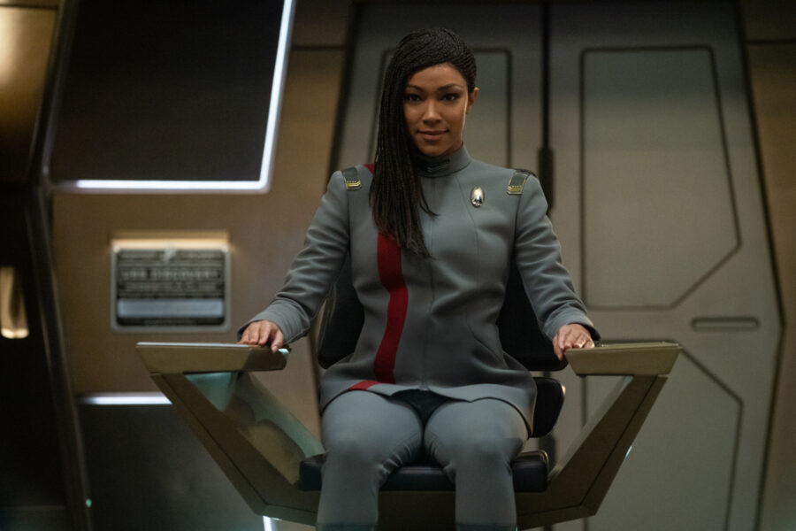
In Season 3 of Star Trek: Discovery, our favorite characters get new uniforms that feel like a serious downgrade: those beautiful blue costumes get replaced with soulless gray uniforms whose dreariness is only broken up by a colorful division stripe. The characters looked blander than ever, and it didn’t help that this season’s storytelling was a serious downgrade from Season 2. Adding insult to injury, these drab uniforms looked way too much like what Kirk and crew wore in Star Trek: The Motion Picture, and that movie’s pastel pajamas are widely considered some of the worst uniform designs in the franchise.
Star Trek: Discovery Season 4 tried to correct this terrible design, replacing the blandness of the previous season with uniforms that were bold and colorful. That’s a good idea on paper, but in practice, the new uniform designs looked like what you’d get if you ordered Original Series costumes from Temu.

It’s hard to take any of these characters seriously when the open flap on the bottom of their tunics makes them look like a white-collar boss who felt wild enough to untuck his shirt and unbutton the bottom buttons to celebrate Casual Friday in style.
No, Captain, My Captain

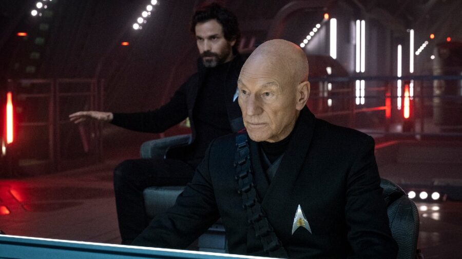
The next Star Trek fashion fail is partially the fault of arguably the most popular living Star Trek actor: Patrick Stewart. When Paramount lured him back for Picard, he was insistent that he didn’t want to wear a Starfleet uniform, which is why his character and his Season 1 crew run around in dark outfits that Stewart might as well have stolen from the set of David Lynch’s Dune. This is a big part of why the first and second seasons are so painful to watch: on top of writing so bad it makes Nemesis look like a masterpiece, the costume design for our series regulars is lazy and completely phoned-in.
The Starfleet uniforms were a bit better than Picard’s crew, but not by much: they alternated between looking like updated TNG Academy uniforms to uniforms that looked like plainer takes on the ones worn in Lower Decks. By Season 3, everyone was just wearing leather jackets with some light Star Trek theming on them.

This caused our returning TNG crew to look (embarrassingly enough) like bikers from an AARP-themed motorcycle club. It was like the producers were deathly afraid for this to look or feel like an actual Star Trek show, which is insane for a wildly expensive revival of the show that definitively brought the franchise back to life.
These Students Failed Fashion 101

The latest offender on the Star Trek fashion front is Starfleet Academy, a show that can’t decide exactly what it wants its protagonists to look like. Sometimes, instructors like Jet Reno wear uniforms that look like colorful hourglasses slapped haphazardly on a large expanse of black fabric.

The Doctor is wearing something akin to a monochrome version of his Voyager outfit, and Holly Hunter’s chancellor is wearing something like a monster maroon tunic without any of the flair. Over at the War College, Commander Nelrec is wearing something that looks like somebody tried to draw the Battlestar Galactica reboot duty blues from memory after being hit on the head.

Incredibly, the cadet uniforms are even more stylistically scattered: they mostly wander the campus in drab grey uniforms that look like an even worse version of what everyone wore in Star Trek: Discovery Season 3. Sometimes, though, they unzip that to wear just tight red shirts and black pants (which they adorn with futuristic tactical vests for rousing games of laser tag). Speaking of laser tag, after winning a single game against the War College, they wear letterman jackets, which leaves me wondering if anyone on the writing staff actually played sports in school.
None of these designs is great (minus the inexplicably comfy-looking Starfleet Academy hoodie), and several are downright ugly. That ugliness is made worse by the sheer visual chaos of characters that have more wardrobe changes per episode than most cosplayers do all year. This is symbolic of Starfleet Academy’s biggest problem as a show: it’s trying to be too many different things all at once, ultimately losing its own identity in a frantic rush to please fans of every era.
Clothing Maketh The Spaceman

Believe it or not, this barely scratches the surface of what makes NuTrek so ugly. I haven’t gotten around to forgettable ship designs (quick, draw the Starfleet Academy teaching ship from memory, I dare you!) and lazy outer space effects that make battles increasingly hard to follow. Those battles alternate between being visually boring (like the Battle of the Binary Stars in Discovery) to pathetically lazy (like Riker threatening the Romulans in Picard with an entire fleet of copy/paste ships). After spending more than $8 million per episode, NuTrek gives us space battles with less variety and excitement than Deep Space Nine did in the ‘90s.


The biggest issue is still the clothing, which has just gotten worse since Discovery first aired nearly a decade ago. Star Trek is a franchise with over half a century of cool clothing designs, and The Next Generation is proof that Paramount once knew how to update the designs that made The Original Series into a pop culture phenomenon. If the creators behind NuTrek are completely incapable of making these shows look decent, they will have nobody but themselves to blame when audiences stop watching altogether.


