
Apple has officially released its updated design kits for Figma and Sketch, providing developers and designers with comprehensive resources for building applications across iOS, iPadOS, and macOS. These updated toolsets, available through the Apple Design Resources portal, reflect the latest interface standards and system-level changes introduced by the company to streamline the development workflow.
The latest iteration of these kits focuses on improving parity between design prototypes and actual production code. By updating component libraries and state support, Apple aims to reduce the friction often encountered when transitioning from a visual design mockup to a functional Swift or SwiftUI implementation. For professional designers and software engineers, these kits serve as the primary reference for system-native UI elements, ensuring that applications maintain a consistent look and feel with Apple’s platform ecosystems.
Key Updates to the Design Toolsets
The most significant change in this release is the enhanced alignment of component naming conventions with Apple’s internal code structure. According to the official Apple Design Resources documentation, these naming changes are intended to facilitate easier communication between design and engineering teams. When design assets share the same nomenclature as the underlying software frameworks, the potential for errors during the implementation phase is significantly minimized.
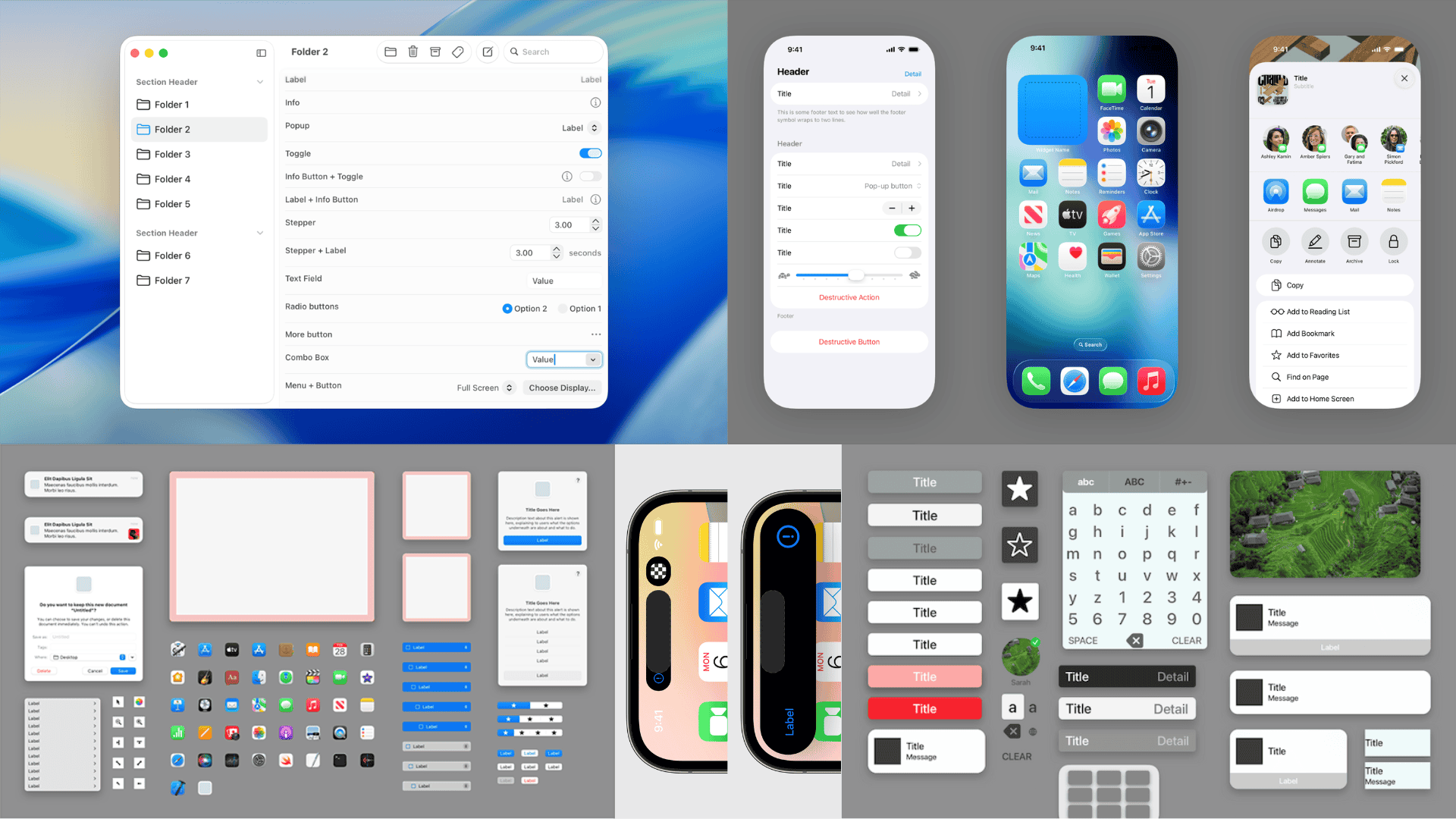
The update also introduces refined support for Liquid Glass, an aesthetic design language component that requires precise visual layering and opacity handling. Furthermore, the kits now feature improved resizing capabilities for common UI components, allowing designers to create more responsive layouts that adapt seamlessly to different screen sizes across the iPhone, iPad, and Mac product lines. These adjustments are verified against the latest developer guidelines provided by Apple to ensure that all assets meet current accessibility and human interface standards.
Expanded Support for macOS Dark Mode
A notable addition to the macOS design kit is the comprehensive implementation of Dark Mode support. While Dark Mode has been a staple of the Apple ecosystem for several years, the latest assets provide more granular control over system-wide appearances. Designers can now utilize updated color tokens and semantic styles that automatically adjust based on the user’s system preferences, a process detailed in the Human Interface Guidelines.
This expansion ensures that developers can accurately visualize how their applications will behave in low-light environments or when a user toggles between light and dark themes. By providing these specific states within the Figma and Sketch files, Apple reduces the need for manual color adjustments, allowing for a more automated approach to theme-aware design. This focus on system-level consistency is part of a broader trend toward unifying the user experience across Apple’s diverse hardware lineup.
Practical Utility for Design Teams
For those currently engaged in active development, the move toward tighter integration between design and code is a welcome shift. The updated component libraries now feature expanded state support, which is critical for complex applications that require multiple interaction states—such as hover, pressed, and disabled—to be clearly defined before development begins. These kits are intended to serve as a single source of truth for UI teams, reducing the time spent on design-to-code handoff meetings.
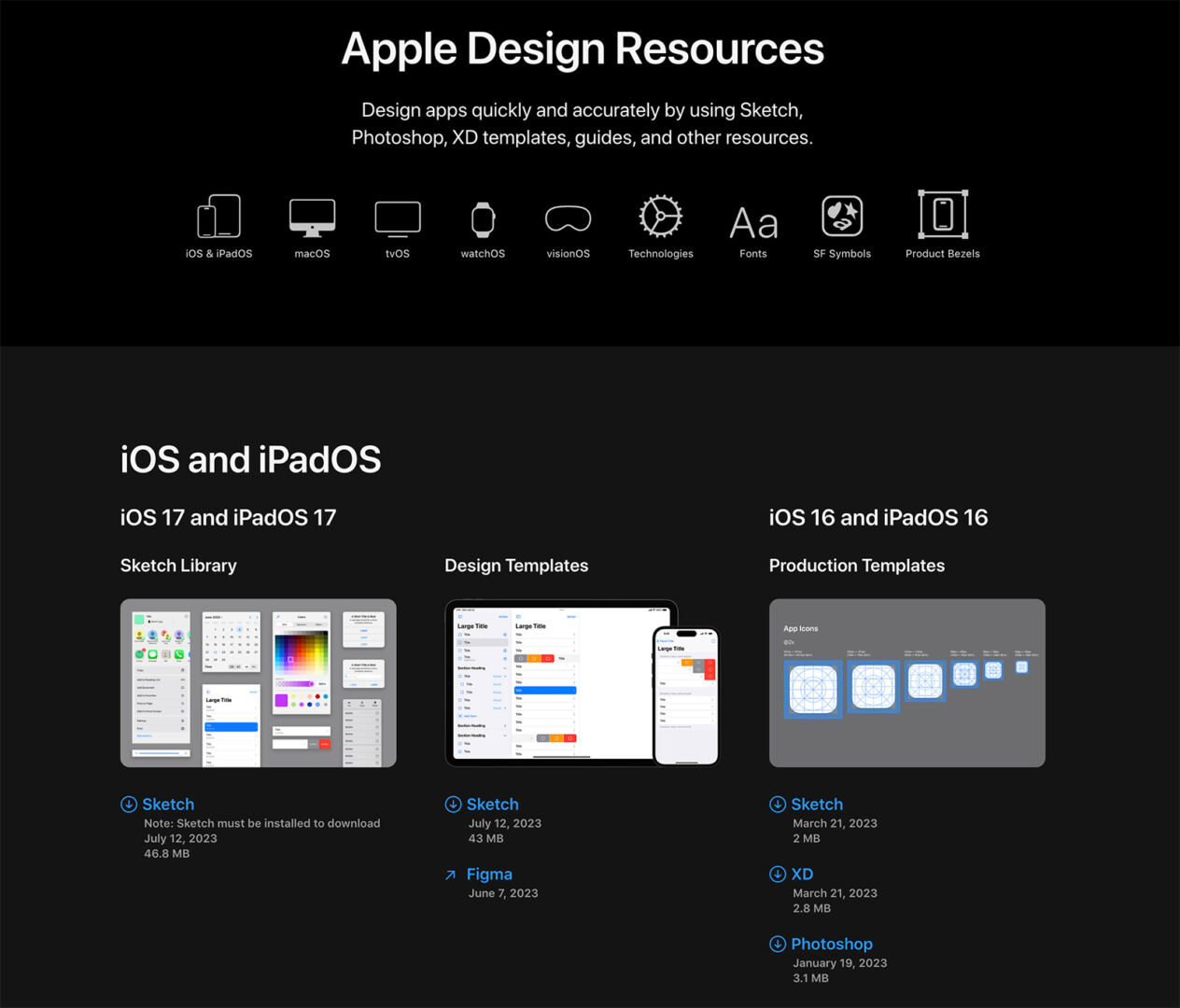
Designers can access the kits by visiting the Apple Design Resources page, where the files are available for both Figma and Sketch. As these tools continue to evolve, they remain the standard for teams building software intended to run natively on Apple platforms. The availability of these resources typically follows major software updates, ensuring that the community has access to the latest interface paradigms as soon as they are finalized by the company.
Looking Ahead: Future Development Cycles
The next major update to these design resources will likely coincide with the next cycle of Apple’s operating system releases, typically announced during the Worldwide Developers Conference (WWDC). Developers and designers are encouraged to monitor the official Apple Developer News portal for announcements regarding future revisions to the design kits or changes to the Human Interface Guidelines. Consistent engagement with these updates is essential for maintaining application performance and adherence to evolving platform standards.
If you found this technical overview helpful, please consider sharing this article with your design and development teams. We encourage you to participate in the conversation by leaving a comment below regarding your experience with these updated design kits and how they have impacted your current project workflows.
Worth a look