
O Sole Mio is bringing the warmth of the Italian south to North American grocery aisles with a comprehensive brand overhaul designed to modernize its presence in the competitive ready-to-eat market. The company has unveiled a new brand image and a completely redesigned packaging platform, aiming to blend traditional family values with a bold, contemporary aesthetic.
Developed in collaboration with the agency PIGEON, the redesign draws primary inspiration from the light, warmth, and generosity associated with Southern Italy. This strategic shift is intended to provide the brand with a more emotional and distinctive identity, moving away from the rigid codes often found in the prepared-meals category to better support the company’s growth across Canada and the United States via Grenier.
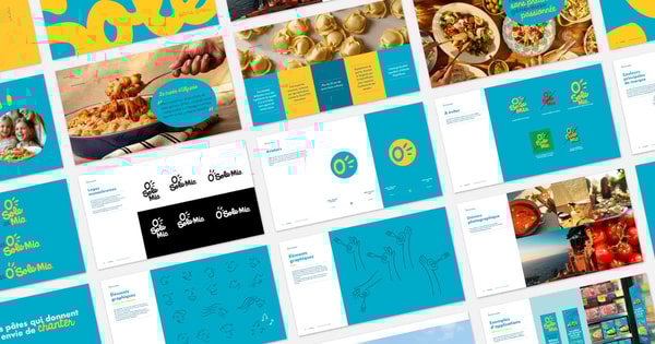
The O Sole Mio brand redesign centers on a “solar territory,” using the sun of Naples as the creative thread that ties together the brand’s visual language. This theme manifests through specific choices in typography, illustration, and product staging, all designed to evoke the atmosphere of the Mediterranean.
The Visual Language of Neapolitan Blue
A cornerstone of the new identity is the introduction of “Neapolitan blue” as the brand’s signature color. This specific hue was selected to evoke the sea, the sky, and the salt air of Naples, providing a strong visual anchor for consumers navigating retail environments. By establishing this distinct color palette, the brand seeks to create an immediate emotional connection with the buyer whereas ensuring high visibility on the shelf.
The new design does not rely on color alone; it integrates a mix of high-quality photography and playful illustrations. This combination is paired with “human graphic gestures” to maintain the brand’s soul as a family-oriented business while updating its expression for a global audience.
Scaling for the North American Market
The scope of this rebranding effort is extensive, covering a product range of more than 80 items distributed across Canada and the United States via Grenier. The updated packaging platform is applied across several diverse product lines, including:
- Traditional sauces
- Fresh pasta
- Frozen entrees
- Mealkit-style assembly meals
To manage this large volume of products, the agency implemented a color-based navigation system. This system is designed to simplify the shopping experience, allowing consumers to quickly identify different product categories through visual cues, thereby reducing friction during the purchasing process.
Balancing Tradition and Innovation
The primary challenge of the redesign was to modernize the brand’s image without erasing its heritage. O Sole Mio is recognized for its Neapolitan-inspired recipes and the freshness of its ingredients; the new visual identity focuses on the balance between tradition, pleasure, and innovation.

By moving away from the classical codes of the ready-to-eat category, the brand has positioned itself as an “invitation to share,” transforming functional packaging into a festive and engaging visual experience. The goal is to ensure that the brand’s growth in North America is supported by a platform capable of evolving alongside the company’s expanding catalog.
Key Design Elements at a Glance
| Element | Strategic Implementation |
|---|---|
| Core Theme | The Sun of Naples (Solar Territory) |
| Signature Color | Neapolitan Blue (Sea, Sky, Salt Air) |
| Product Scope | 80+ products in Canada and the USA |
| UX Feature | Color-coded navigation system for shoppers |
| Creative Partner | PIGEON Agency |
As O Sole Mio continues to roll out its new glance across North American retailers, the brand aims to solidify its position as a premier provider of authentic Italian-inspired convenience foods. The transition from a simple refresh to a full expression platform marks a significant step in the company’s international scaling strategy.
For more updates on the rollout of the new packaging and product availability, consumers can monitor the brand’s official social media channels.
Do you think bold color choices like “Neapolitan blue” effectively influence your shopping decisions in the grocery aisle? Share your thoughts in the comments below.