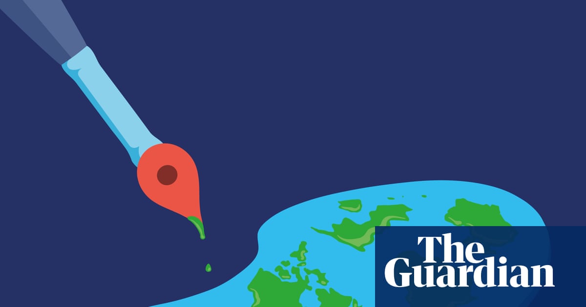
The illusion of Perfect Maps: Why Every Cartographic Portrayal is a Story, Not a Truth
For centuries, humans have strived to capture the world on a flat surface. But the quest for the “perfect” map is,ultimately,a futile one. As cartographers and critical geographers are increasingly demonstrating, every map is a deliberate interpretation, shaped by its creator’s perspective, the technology available, and the story they aim to tell.
this isn’t a dismissal of maps – far from it. They remain invaluable tools for navigation, analysis, and understanding our world. Though,recognizing thier inherent limitations is crucial for responsible interpretation. You need to understand how a map is constructed to truly grasp what it’s communicating.
Beyond the Lines: The politics of Mapping
Recent scholarship highlights how maps can reinforce existing power structures. Critics have pointed out that some disease ecology maps, for example, disproportionately blame poorer regions for outbreaks.This approach conveniently overlooks the role of large corporations whose land-use investments often drive the ecological changes that facilitate disease transmission.
The message is clear: follow the money. The true hotspots of ecological disruption – and potential disease emergence – often lie in global financial centers like London, New York, and Hong Kong. Maps,therefore,aren’t neutral; they can be instruments of blame or tools for uncovering systemic issues.
The Unattainable Ideal: Distortion is Inevitable
Technical advancements allow for increasingly sophisticated data visualization. Animations can reveal historical trends, like the evolution of slavery in the American South, with greater nuance than static maps. Yet, even these dynamic representations focus on specific narratives. They highlight abolition, but can obscure the enduring scars of slavery itself.
The core issue is that depicting a three-dimensional sphere on a two-dimensional plane always introduces distortion. Perfection is unattainable. accepting this allows for a more forgiving approach to imperfection, and a more critical eye toward the choices made in map creation.
The Mercator Projection: A Case Study in Trade-offs
Consider the Mercator projection,created in the 16th century for navigational purposes. It accurately represents shapes and angles at small scales, making it ideal for sailors. However, it dramatically exaggerates the size of landmasses near the poles relative to those near the equator.
For a long time, cartographers abandoned the Mercator projection due to these distortions and its historical association with colonialism. surprisingly, it experienced a resurgence around 2005 as the standard for web mapping applications. Developers cleverly minimized its flaws by limiting zoom levels or switching to spherical views at larger scales. This demonstrates how context and technological solutions can breathe new life into even outdated cartographic techniques.
What This Means for You
So, how can you become a more informed map reader? Here are a few key takeaways:
* Question the source: Who created the map, and what might their agenda be?
* Consider the projection: What distortions are inherent in the chosen projection?
* Look beyond the surface: What information is not included on the map?
* seek multiple perspectives: Compare different maps of the same area to gain a more comprehensive understanding.
Ultimately,remember that a map is a story,not a definitive truth. By approaching maps with a critical and informed perspective, you can unlock their true potential as powerful tools for understanding our complex world.
Further Exploration
Want to delve deeper into the world of critical cartography? Here are some excellent resources:
* Free the Map by Henk van Houtum (NAI, £38.25) – A thought-provoking exploration of the politics of mapmaking.
* Radical Cartography by William Rankin (Picador, £30) – Challenges conventional mapping practices and explores alternative approaches.
* Secret Maps by Tom Harper, Nick Dykes and Magdalena Peszko (British Library, £40) – Uncovers fascinating and frequently enough overlooked historical maps.
Worth a look