
The Xbox Rebranding: Analyzing the Reported Shift Toward an ‘XBOX’ Identity
In the fast-moving world of consumer electronics and digital ecosystems, a change in typography can signal much more than a simple font update. Recently, gaming enthusiasts and tech observers have noted a subtle but distinct shift in the visual identity of one of the world’s most recognizable gaming brands. Observations suggest that the traditional “Xbox” branding is increasingly appearing in an all-caps “XBOX” format across various digital touchpoints.
While a formal, sweeping corporate rebranding announcement has not been issued by Microsoft, the emergence of this new typographic style has sparked significant conversation within the gaming community. This evolution in visual language—moving from the familiar sentence-case “Xbox” to the more assertive, capitalized “XBOX”—raises important questions about the future direction of Microsoft’s gaming division and its broader brand strategy.
For a brand that has spent decades building a massive, multi-platform ecosystem, even minor changes in brand presentation can have far-reaching implications. As the industry moves toward more integrated, service-oriented models, the way a brand “speaks” visually becomes a critical component of its identity in a crowded global market.
A Visual Evolution: From ‘Xbox’ to ‘XBOX’
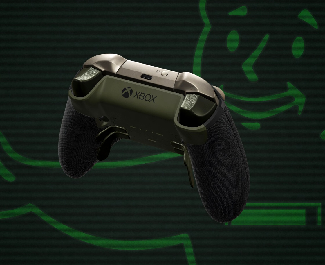
The core of the current discussion centers on a perceived shift in typography. For years, the “Xbox” name has been presented with a standard capitalization, a look that has become synonymous with the brand’s hardware, such as the Xbox Series X and Xbox Series S, as well as its digital services. However, recent sightings of the all-caps “XBOX” logo in certain user interfaces and promotional materials have suggested a move toward a more high-impact, minimalist aesthetic.
In the design world, the transition to all-caps typography is often used to convey a sense of authority, modernity, and permanence. For a gaming brand, this could be a strategic move to align with the “next-gen” feel of its current hardware lineup. The bold, blocky nature of capitalized letters mirrors the powerful, high-performance image that Microsoft has sought to cultivate with its latest consoles, which feature lightning-fast load times and advanced framerates.
It is important to distinguish between a formal corporate name change and a visual identity update. A name change implies a legal and structural shift in how a company is registered, whereas a branding update—or “rebranding”—is often a stylistic evolution designed to refresh a brand’s image without altering its fundamental existence. At this stage, the evidence points more toward a stylistic refinement of the Xbox brand identity rather than a total dissolution of the existing brand.
The Strategic Importance of Gaming Brand Identity
Why does a change in how a word is written matter so much? In the context of the modern gaming industry, branding is the glue that holds together a complex web of hardware, software, and subscription services. The Xbox ecosystem is no longer just a console; it is a sprawling network that includes cloud gaming, handheld devices, PC integration, and the massive Xbox Game Pass library.

As Microsoft continues to expand its footprint, the brand must remain cohesive across vastly different environments. Whether a player is accessing a game on a high-end console, a mobile device, or a cloud-enabled smart TV, the brand identity must be instantly recognizable and authoritative. A shift to a more striking, capitalized “XBOX” could be part of an effort to create a more unified and “premium” feel across these diverse platforms.
branding plays a crucial role in how a company positions itself against competitors. In a market defined by intense rivalry, the visual language of a brand can communicate its values. A shift toward a more bold, assertive typeface can signal a brand’s confidence and its intention to lead the next era of interactive entertainment. This is particularly relevant as the industry moves deeper into the realms of high-fidelity graphics, artificial intelligence, and complex digital ecosystems.
Navigating the Microsoft Gaming Ecosystem
The evolution of the Xbox brand is inextricably linked to the evolution of its products. The current generation of hardware, headlined by the Xbox Series X, has already set a high bar for performance. As we look toward the future, the brand’s visual identity will likely continue to evolve alongside its software offerings and hardware iterations.
We are seeing a trend where gaming companies are moving away from being “hardware-first” companies to being “ecosystem-first” companies. For Microsoft, Which means the “Xbox” name must represent more than just a box under a television; it must represent a lifestyle of seamless, cross-platform play. This strategy is supported by initiatives like Xbox Game Pass, which aims to provide access to hundreds of games across multiple devices, effectively decoupling the brand from any single piece of hardware.
As the brand identity matures, we can expect to see it integrated more deeply into the user experience. This includes everything from the design of the dashboard and user interface to the aesthetic of upcoming major titles. For instance, the anticipation surrounding new releases, such as the Forza Horizon 6 collection, demonstrates how much the brand’s visual and cultural presence impacts consumer excitement and engagement.
Key Takeaways
- Observed Shift: There is a noticeable trend toward using all-caps “XBOX” typography in various digital spaces.
- Branding vs. Rebranding: Current evidence suggests a visual identity update rather than a formal, legal name change.
- Strategic Goal: The shift likely aims to project a more modern, authoritative, and unified brand image across the entire ecosystem.
- Ecosystem Integration: This evolution aligns with Microsoft’s move toward a service-centric model (e.g., Game Pass) that spans consoles, PC, and mobile.
Frequently Asked Questions
Has Microsoft officially changed the name of Xbox to XBOX?
As of mid-May 2026, there has been no official corporate announcement confirming a formal name change. The shift appears to be a visual rebranding or a change in typographic style rather than a legal name change.

Why is the logo changing to all caps?
In design, all-caps typography is often used to convey strength, authority, and a modern aesthetic. This aligns with the high-performance branding of the Xbox Series X and the broader gaming ecosystem.
Will this affect my Xbox Game Pass subscription?
No. Changes to visual branding or logos do not affect the underlying services, subscriptions, or the functionality of your existing hardware and software.
Does this mean Xbox is moving away from consoles?
Not necessarily. While Microsoft is expanding into cloud and PC gaming, the Xbox brand remains deeply rooted in its console hardware, including the Series X and Series S lineups.
The next major checkpoint for clarity on this topic will be any official communications or press releases from Microsoft regarding their brand identity or upcoming hardware refreshes. We will continue to monitor official channels for any formal confirmation of these branding shifts.
What do you think about the new “XBOX” look? Is the all-caps typography a step in the right direction, or do you prefer the classic “Xbox” style? Let us know in the comments below and share this article with your fellow gamers!